Google Inc. Clock App
With an aggregate 4.2 star rating in the Google Play Store and 100-500 million downloads, this app packs a functional punch into a small, simple package.

Interface
Opening the app causes the user to immediately encounter a bold blue, white, and gray interface. Blue is the world’s most popular color and tends to create perceptions of friendliness and trustworthiness, on top of promoting alertness and well-being which are positive things that Google would like to facilitate. The singular floating action button in a softened red creates a focal point specifically highlighting the action button.
Material Design
This graphical user interface (GUI) is a standard example of how Google’s design language, Material Design, uses design theories and principles to enhance their interfaces.
As Google Inc.’s flagship alarm and timer app, there has been a lot of effort put into the platform to keep consistency both externally and internally among other Google products. The notion of “material design” is the name of Google’s design language across its many applications and their guidelines dictate the interfaces, interactions, and in a sense, ideology of everything Google. In line with Norman’s fundamental argument, Google seeks to engage users in interactions that are intuitive with affordances built in like the usage of shadows and edges to convey input options, and intentional boldness and motion to direct attention.
“The use of familiar tactile attributes helps users quickly understand affordances.”
-Material Design Guidelines
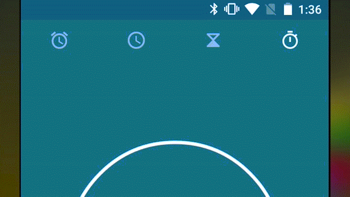
An example of this is the feedback resulting from pressing one of the four central functions. The icon’s color is whitened in contrast to the grayed-out others, and an ink ripple reaffirms what was pressed. The icing on the cake is the emphasis provided with animations bridging the gulf of execution.
Material design is guided by print-based design elements – such as typography, grids, space, scale, color, and imagery – to create hierarchy, meaning, and focus that immerse the user in the experience. Material design adopts tools from the field of print design, like baseline grids and structural templates, encouraging consistency across environments by repeating visual elements, structural grids, and spacing across platforms and screen sizes. These layouts scale to fit any screen size, which simplifies the process of creating scalable apps.
1: Featured Animation Clock by Adam Bubeníček
2: Google Design’s Material Design Guidelines
 Craig Bossley